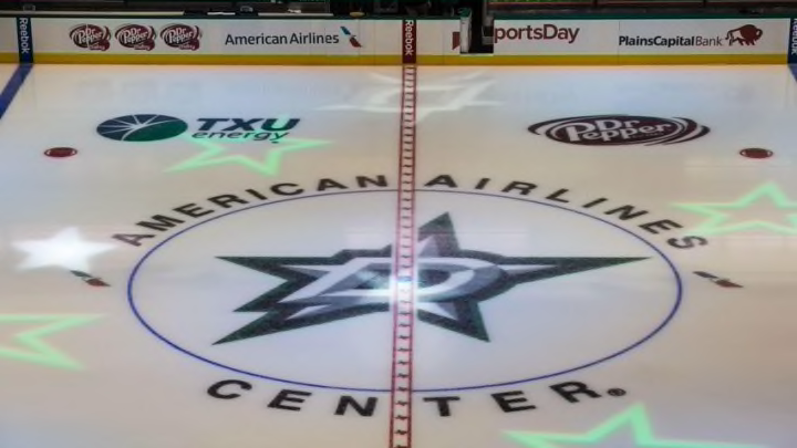
The Dallas Stars made a change for the upcoming 2016-17 season. Their playing surface will look significantly different in the coming year.
You wanted change, you got change. Or maybe you didn’t want change. Either way, there is change happening in the Dallas Stars organization that has nothing to do with the roster or staff.
When you attend your next Stars game, you’ll notice that the ice has taken on a significantly different look.
Over the past few years, Dallas has stuck to using their relatively new logo as their center ice display. The big star can be easily spotted, and the Stars have quickly become known for not only their exuberant new logo, but also their victory green jerseys.
It’s not a half bad way to resemble that everything truly is bigger in Texas. But for the 2016-17 season, it looks like another Dallas Stars image will receive the “Texas” treatment.
More from Dallas Stars News
- Dallas Stars Traverse City Tournament: Who had great performances?
- Grushnikov and Stankoven lead Dallas Stars to 6-3 win over Columbus
- Dallas Stars prospects look to wrap up tournament with a win
- Burn the tapes: Dallas Stars prospects lose 5-1 to Toronto Maple Leafs
- Dallas Stars look to continue success today against the Maple Leafs
Earlier today, the Stars tweeted out a picture of their new center ice logo. Instead of the big star that graces the chest of their jerseys at the starting face-off circle, the Stars have decided to take a new route and go with their secondary logo at the median.
Here was the picture they released.
New season, new logo at center ice. #Launch1013 pic.twitter.com/RrJyOyZt6W
— Dallas Stars (@DallasStars) September 16, 2016
Now there are a couple of different opinions about the change.
Of course, there are people who love it. It’s a change that hops off the beaten path and helps make the Stars unique in more than one way to the rest of the NHL. Plus, the logo looks awesome, so why not make it bigger?
On the other hand, some people have some complaints. First off, a large chunk of the inside of the logo is blacked out. This is an obvious deficiency considering the puck is all black. The last thing fans want to do is to strain their eyes just to find the puck.
It definitely provides a bright contrast of color that will help liven the ice up a bit more. And then we still have those green jerseys that will have no trouble standing out.
Next: Stars To Watch Out For In Traverse City Tournament
Do you like the logo change? It’s definitely going to take some time to adjust, but this move definitely helps the Dallas Stars stand out in a special way. Except for that stupid red line through the center (for more information, check out any one of Razor’s tweets ever).
